Now that we have a portrait layout designed, let’s tackle the landscape layout.
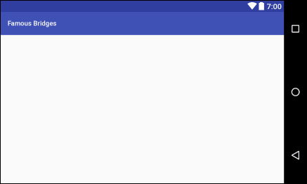
Load up your activity_main.xml file, the one in the layout-land
folder. You’ll know when you have the right one because it looks like this in
Android Studio:
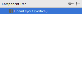
Now have a look at the Component Tree. You’ll see that the parent layout is
a LinearLayout:
However, we don’t want this type of layout. We’d like a ConstraintLayout,
just like our other activity_main.xml file. You can easily convert it.
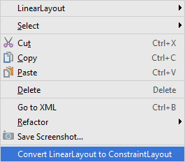
Right-click LinearLayout (vertical) in the Component Tree. From the
menu that appears, select Convert LinearLayout to ConstraintLayout:
You’ll probably get a warning box popping up when you try to convert your layout:
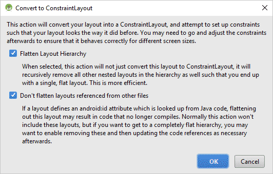
Click OK on this warning, as we really don’t have any other layouts, views,
or code to worry about.
Your Component Tree should now look like this in earlier versions of
Android Studio:
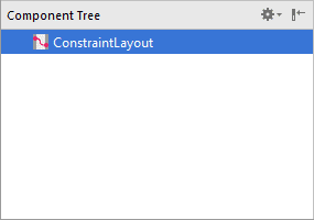
In later versions, the vertical part after Liner Layout will just get
removed, and you’ll be left with linearLayout in the Component
Tree.
Now drag an ImageView from the Palette onto the Component Tree, or
onto the white layout canvas. When you get the Resources dialogue box
up, select your bridge image:
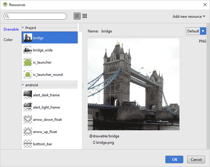
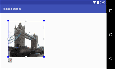
Click OK to add the image. The ImageView on the white layout might be in the
upper left corner. Drag it out and down a bit to give yourself some room to
add the constraints:
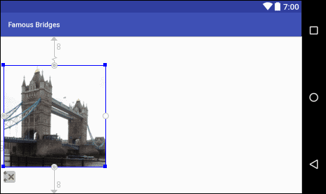
Hold your mouse over the left middle white circle, and the circle will turn
green. Drag to the left edge of the screen. Now do the same for the top middle
white circle and the bottom middle white circle. Your ImageView should look
like this:
Have a look at the properties area on the right:
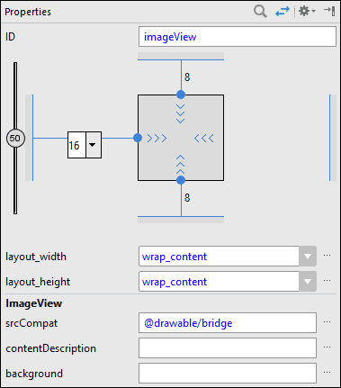
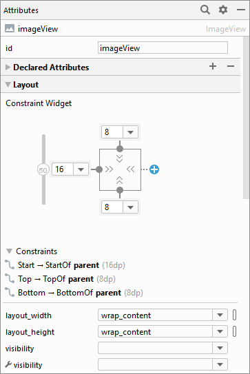
You can set a bigger left margin, if you like. We’ve set ours to 16.
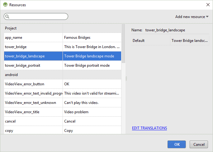
For the contentDescription property, set that to your tower_bridge_landscape
string resource:
Now we can add the TextView. We’ll do that in the next lesson below.
< Portrait
View Design| Configure the TextView >
Back to the Android Contents Page
